Category: Creative Direction
Another Business Card
 I designed a new business card for myself this year, I only really use them when I travel for business so every year I’ll make a new design for fun. This one has been really popular, several people from Imagine Nation and Books are fun saw mine and wanted one of their own. I really love this coffee shop chalkboard trend because I am such a big fan of typography. I hope it lasts for a while!
Porcelain Dome Light
This item was designed for Jordan Mark, a gift company. I love designing square boxes. For some reason I don’t get many products in a square box, the symmetry appeals to me. This Item was super sweet and nicely made but it was difficult to know what to call it. They did not want to call it a night light because it would limit the customer’s impression of what they could do with it. Originally all the samples I received were butterflies and flowers so I wanted to call it “Luminous Garden Lamp”. They told me that there would be some with nativity scenes on them and the whole collection needed to have one name. So after much back and fourth the name was made more generic. A lot of the Jordan Mark collection is blue so I wanted it to complement the other items they sell. I love the look of old with new, the old label with the fresh blue pattern turned out really elegant and unique.


Butterfly Sticky Note Organiser
This is a handy little album of sticky notes I designed for Imagine Nation.
 I designed it by using a few favorite elements. I love the typography of the early 1900’s so I created a background using a few of the french posters I found and arranged them onto a scan of some antique paper. I had beautiful photos of butterflies that I thought would really liven up the subtle background, I used a slight oil painting filter on top of the butterflies for detail. I photographed some satin ribbon and played around until I found this blue that I really liked. The stripes were all one color originally but I changed them to this palette of colors that I thought were fun and contemporary.

All of the pads here are sticky on the back so you can post them up where it’s convenient. I decided to do a weekly schedule on the pad rather than leaving it blank because I wanted this to be an organizer and the layout helps you plan out your week.
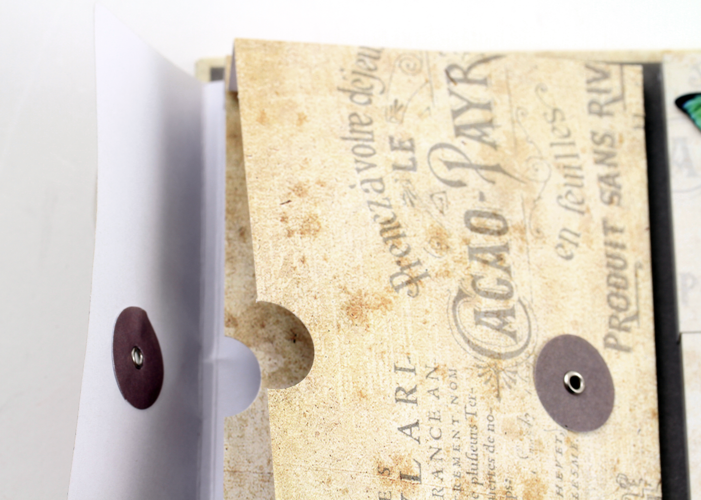 This divider pocket is designed to hold your receipts or other little notes.

 I added spot uv coating on top of the butterflies to make them really bright and also to make them look more dimensional and separated from the background. I love how it feels with the smooth texture on top of the satin matte background.
 Here is the back of the organizer, I didn’t want to miss a spot where I could put more butterflies!
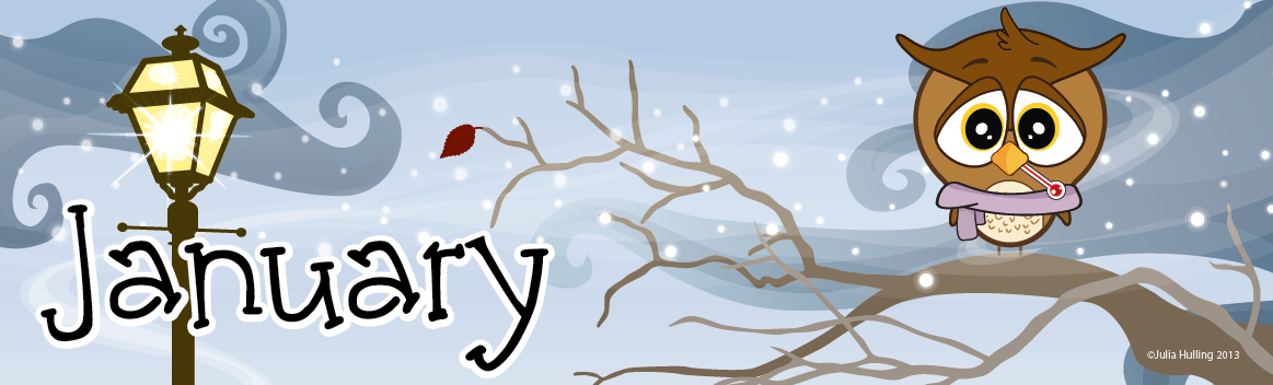
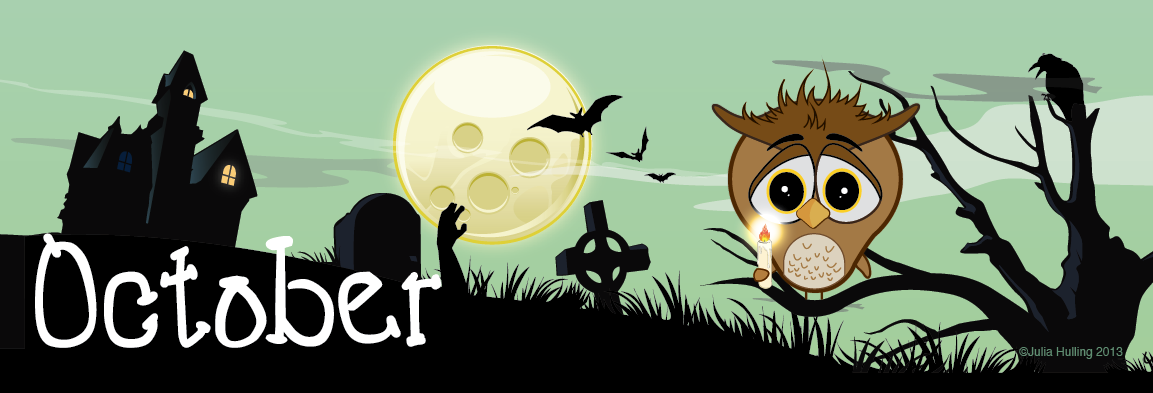
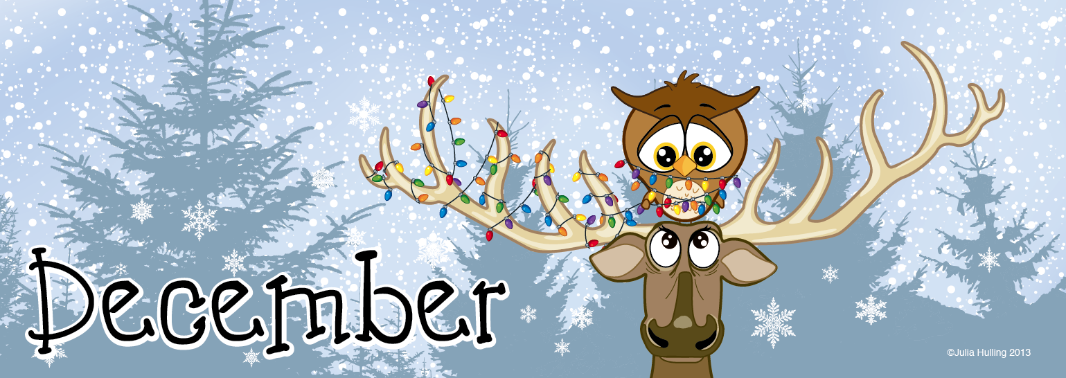
Hubert The Unfortunate Owl ~
I love this sad little owl. I drew him up one night after not being able to find artwork for a family friendly calendar. A buyer wanted an owl calendar, but though there is a TON of owl artwork out there, I couldn’t find 12 pieces that would work for the 12 months of the year. I had a lot of fun thinking of 12 different ‘funny’ calamities that might happen to him and love all of the little side characters I invented for him. I would love to turn it into an actual flash cartoon, wish I had the time to do it now. Here are the 12 months of my illustrations and a mock-up of the item I designed him for:
Also, internet world, don’t steal him or I’ll come after you *cracks knuckles*


Birdsong note cards
I designed a smaller fold up box much like the one I designed for Trey Ratcliff’s photography greeting cards for note cards. This time I wanted to go in a completely different art direction and chose to base the box off of Michelle Palmer’s stunning song bird watercolors.

The most difficult part of the process was removing the white watercolor paper behind her paintings so that I could design the box and reformat the artwork to note card size without huge gaps anywhere. The paintings didn’t all coordinate so I had to add or tweak details to make them all look like a set and reformat every design to a 4×6 format. The box design and layout was much easier. Michelle painted a large beautiful painting for me to use on the background of this box.

 Once I finished the cards and the box I designed the envelopes using old sheet music and vintage lithograph bird eggs I found in a copyright free book for sticker seals.

I had the cards printed on uncoated soft paper with the added texture to the cards. This set came out really well for a first run, there are a few little details I will change if the test results come out well. All in all, a very beautiful product.


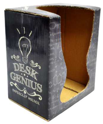
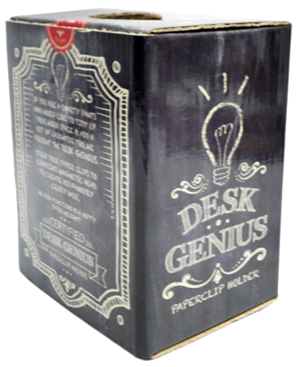
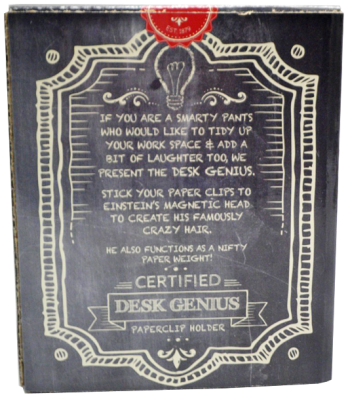
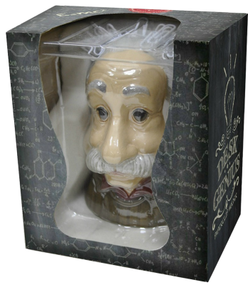
Desk Genius
We’ve sold a paperclip holder before called “bad hair day” where paperclips stuck to a magnetic head and it sold fairly well but the item was pretty ugly! A buyers assistant had the great idea of making it an Einstein head! I sent some illustrations to our manufacturer of Einstein done in a cartoon style and explained what I was looking for and this is what he came up with:
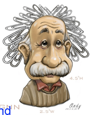 Andy is amazingly talented!!
Then I came up with the item name and designed the packaging. I drew the design out on a chalkboard and put it into illustrator. I’m not always the best with words but I think that the description on the back turned out simple and clever Great team effort!
Eco-friendly Bamboo
This cookbook holder holds the book open to the page you desire and protects it from splatter. Pretty good idea! This was part of an eco-friendly bamboo product display so I was asked to make the packaging appeal to that market specifically. The second Item was a part of the whole eco-friendly display as well, photo frame coasters.


Café Coaster Set
These classic café coasters were another inexpensive item that Books Are Fun wanted to dress up. I made the box look like a little coffee shop to demonstrate visually what the product was about and used the chalkboards to write information about the product. These coasters were made out of really nice material for the price so I created a die-cut window so the customer could see and touch the actual item.


Beveled glass cutting board/coaster sets
This format has sold well for the last few years, you get two cutting boards and four coasters for a reasonable price. I pick a few new artists every year to paint the design but this is the packaging design I’ve come up with for it. I change the background color and text with each new set but the design is always the same.
It really dresses up a very inexpensive product.


Flier Promoting School Catalog Program
This is the flier that was mailed out to get people excited about the catalog program that Imagine Nation Books & Gifts did. I designed it to get as much info across as I could at first glance. People don’t really look at their mail very long so I made the message large and sort of bullet pointed the ideas. I love the class photograph I found, I searched through thousands of stock photos to find it, great mix of ethnicity and almost everyone is smiling.

